


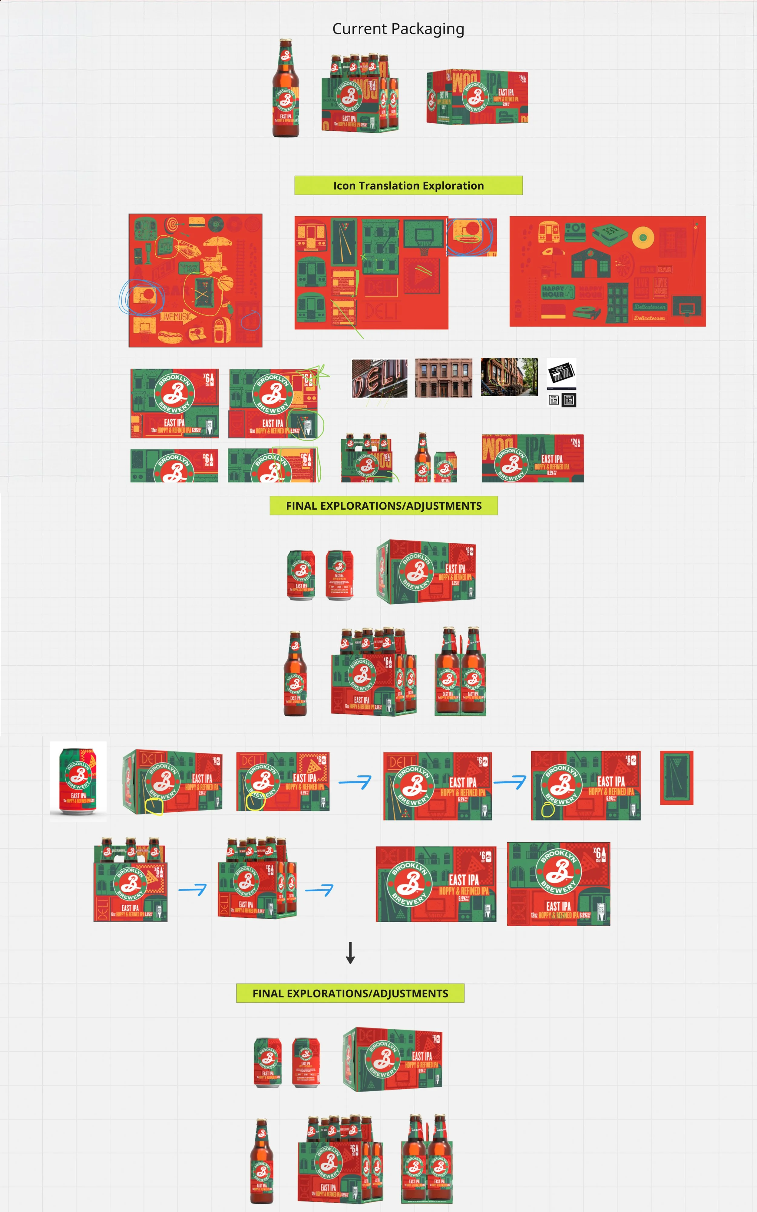


Brief: Brooklyn Brewery is refreshing East IPA to better connect with today’s drinkers and solidify its place as a true NYC IPA. The current packaging feels dated, and we need to reposition the beer with copy and visuals that proudly reflect its New York City roots in an authentic and respectful way. While evolving the design, we must preserve the existing packaging architecture to ensure strong customer recognition and continuity on-shelf.
Deliverables: Sub-Brand Color Story & Visual Identity, Brand World Creation, Packaging & Labeling, Copy Integration
________________
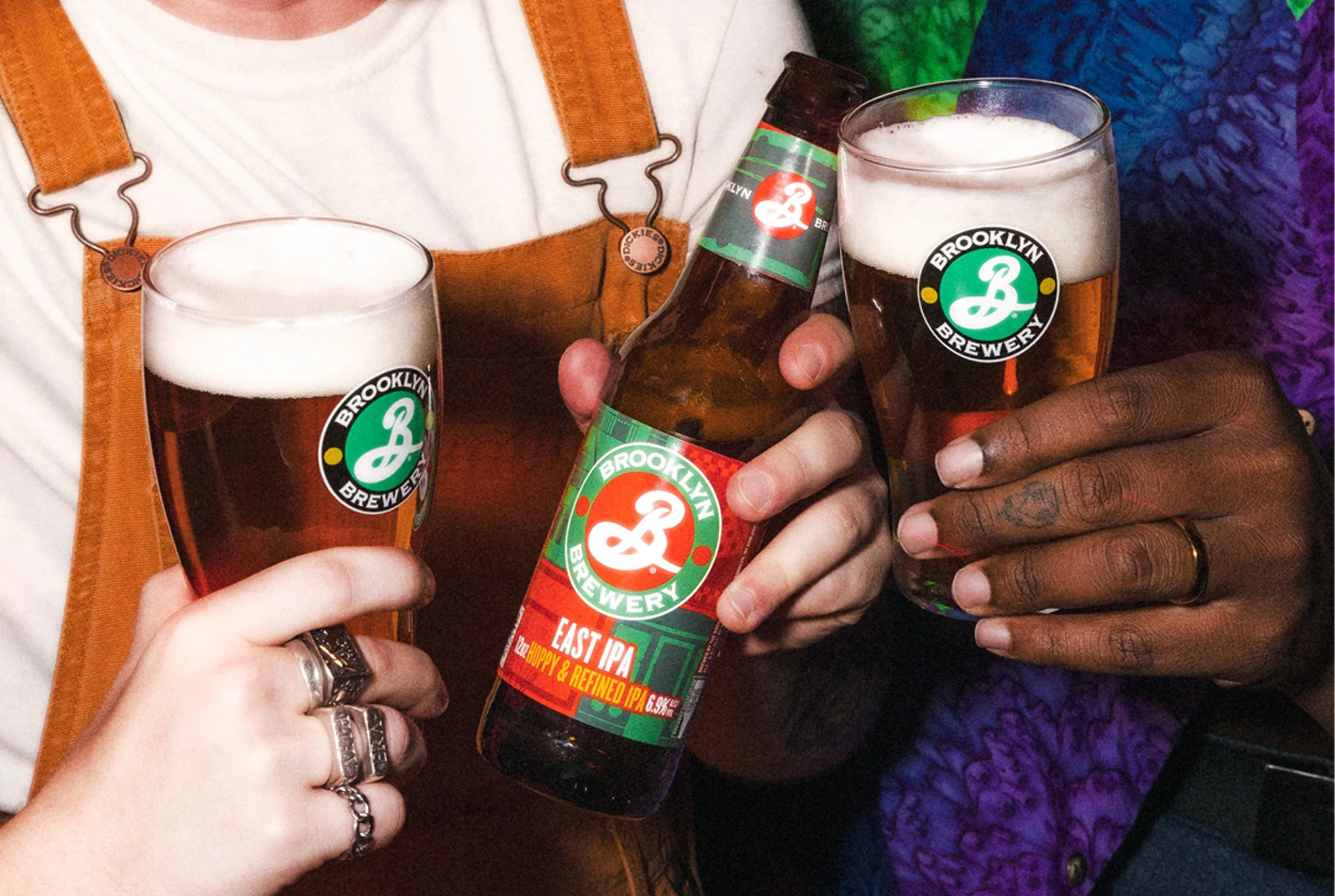
Name: East IPA
Tagline: Fresher Than Ever
Back of Pack Copy: East IPA is a classic IPA with fresh Brooklyn flair. Packed with citrusy American hops and a clean finish, it could only be from NYC.
Tasting Notes: Hoppy | Citrus | Timeless
Product Descriptors: Hoppy. Citrus. Timeless.
Sell Sheet Copy: Brooklyn East IPA is a uniquely balanced IPA that could only come from New York City. Our home demands the best of everything, so we delivered with bold aromas of vibrant orange peel and stone fruit from citrusy American hops, a clean finish, and plenty of Brooklyn flair. It’s the IPA of choice for hop fans and new drinkers across New York and around the globe. If you know, you know how refreshing East IPA is – and if you don’t know, we’re here to spread the word.
Profile: Uniquely balanced with notes of vibrant orange peel and stone fruit from citrusy American hops.
Pairings: Spicy chilies, red curry, crab cakes, hanger steak, passport stamps, and aged cheddars
________________
Brand Direction: Joseph Battiato
Brand Positioning: Joe Soriero
Art Direction: Ashley Swope
Copy: Kelly Tesoriero & Tim Rozmus